Visualising data is an important tool to gain a understanding of a dataset. However, we are limited with the amount of dimension we can plot. One, two and even three dimensions we can intuitively comprehend, but anything beyond three dimension is hard for us. One use of PCA is having a multidimensional dataset with more than three dimensions and capture the two most principal components. In this way we can plot a high-dimensional dataset on a 2D plot without losing too much of the information.
library(cluster)
data(animals)
animals <- na.omit(animals)
We can try to apply this principle on the animals dataset from the cluster package.
The animals dataset contains information about twenty different animals.
Whether they are warm-blooded (war), can fly (fly), have a spinal column (ver from vertebrate, gewerveld in dutch), are endangered (end), live in groups (gro) or have hair (hai).
> names(animals)
[1] "war" "fly" "ver" "end" "gro" "hai"

> head(animals)
    war fly ver end gro hai
ant   1   1   1   1   2   1
bee   1   2   1   1   2   2
cat   2   1   2   1   1   2
cpl   1   1   1   1   1   2
chi   2   1   2   2   2   2
cow   2   1   2   1   2   2
A value of 1 means ‘no’, 2 means ‘yes’. So an ant is not warm-blooded, cannot fly, has no spinal column, is not endangered, does live in groups and does not have hair.
Questions
- Perform PCA on the animals data set and store the object in
pr.out. Make sure that you scale the data. - Store the principal component loadings in
pr.rotation - Calculate the proportion of variance explained by each principal component and store it in
pve
MC1:
The proportion of variance explained by first three principal components is:
- 14.2%
- 40.2%
- 61.1%
- 75.2%
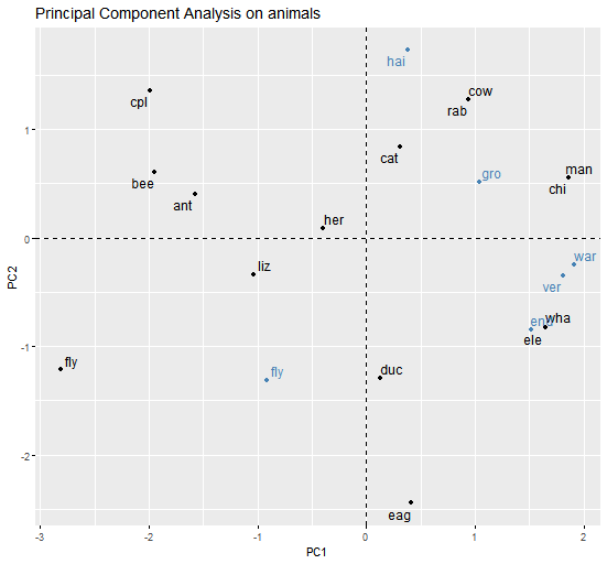
Here is a PCA plot (the variables are coloured in blue to avoid overlap of labels):

MC2:
When looking at the plot, you can see that:
- The bee and ant are similar
- The chimpanzee (
chi) and man are similar - The cat and fly are not similar
- All of the above
- None of the above
Assume that:
- The
clusterlibrary has been loaded - The
animalsdataset has been loaded and attached