We start by describing some principles for encoding data. There are several approaches at our disposal including position, aligned lengths, angles, area, brightness, and color hue.
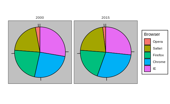
To illustrate how some of these strategies compare, let’s suppose we want to report the results from two hypothetical polls regarding browser preference taken in 2000 and then 2015. For each year, we are simply comparing five quantities – the five percentages. A widely used graphical representation of percentages, popularized by Microsoft Excel, is the pie chart:

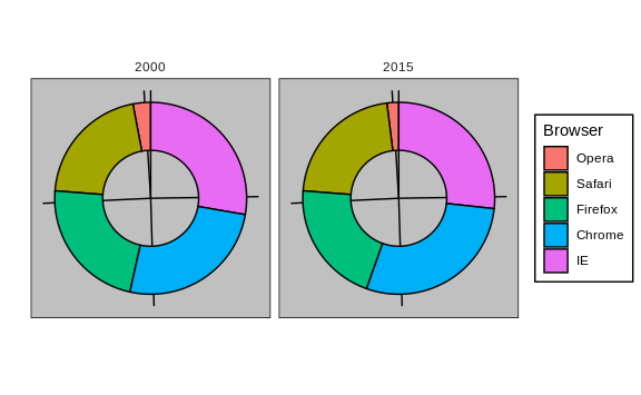
Here we are representing quantities with both areas and angles, since both the angle and area of each pie slice are proportional to the quantity the slice represents. This turns out to be a sub-optimal choice since, as demonstrated by perception studies, humans are not good at precisely quantifying angles and are even worse when area is the only available visual cue. The donut chart is an example of a plot that uses only area:

To see how hard it is to quantify angles and area, note that the rankings and all the percentages in the plots above changed from 2000 to
- Can you determine the actual percentages and rank the browsers’
popularity? Can you see how the percentages changed from 2000 to 2015?
It is not easy to tell from the plot. In fact, the
pieR function help file states that:
Pie charts are a very bad way of displaying information. The eye is good at judging linear measures and bad at judging relative areas. A bar chart or dot chart is a preferable way of displaying this type of data.
In this case, simply showing the numbers is not only clearer, but would also save on printing costs if printing a paper copy:
| Browser | 2000 | 2015 |
|---|---|---|
| Opera | 3 | 2 |
| Safari | 21 | 22 |
| Firefox | 23 | 21 |
| Chrome | 26 | 29 |
| IE | 28 | 27 |
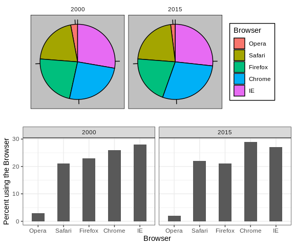
The preferred way to plot these quantities is to use length and position as visual cues, since humans are much better at judging linear measures. The barplot uses this approach by using bars of length proportional to the quantities of interest. By adding horizontal lines at strategically chosen values, in this case at every multiple of 10, we ease the visual burden of quantifying through the position of the top of the bars. Compare and contrast the information we can extract from the two figures.

Notice how much easier it is to see the differences in the barplot. In fact, we can now determine the actual percentages by following a horizontal line to the x-axis.
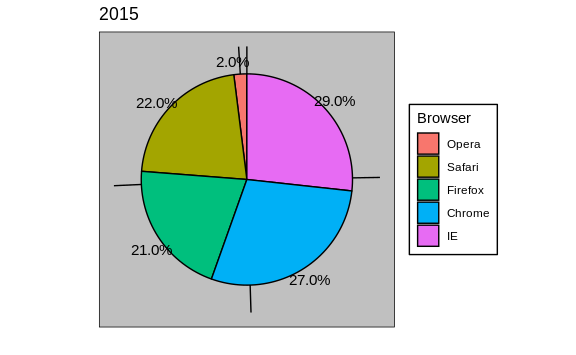
If for some reason you need to make a pie chart, label each pie slice with its respective percentage so viewers do not have to infer them from the angles or area:

In general, when displaying quantities, position and length are preferred over angles and/or area. Brightness and color are even harder to quantify than angles. But, as we will see later, they are sometimes useful when more than two dimensions must be displayed at once.