The plots below show three continuous variables.
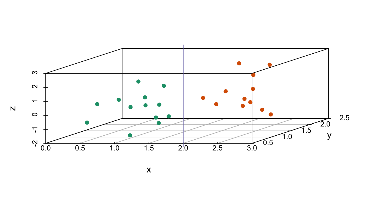
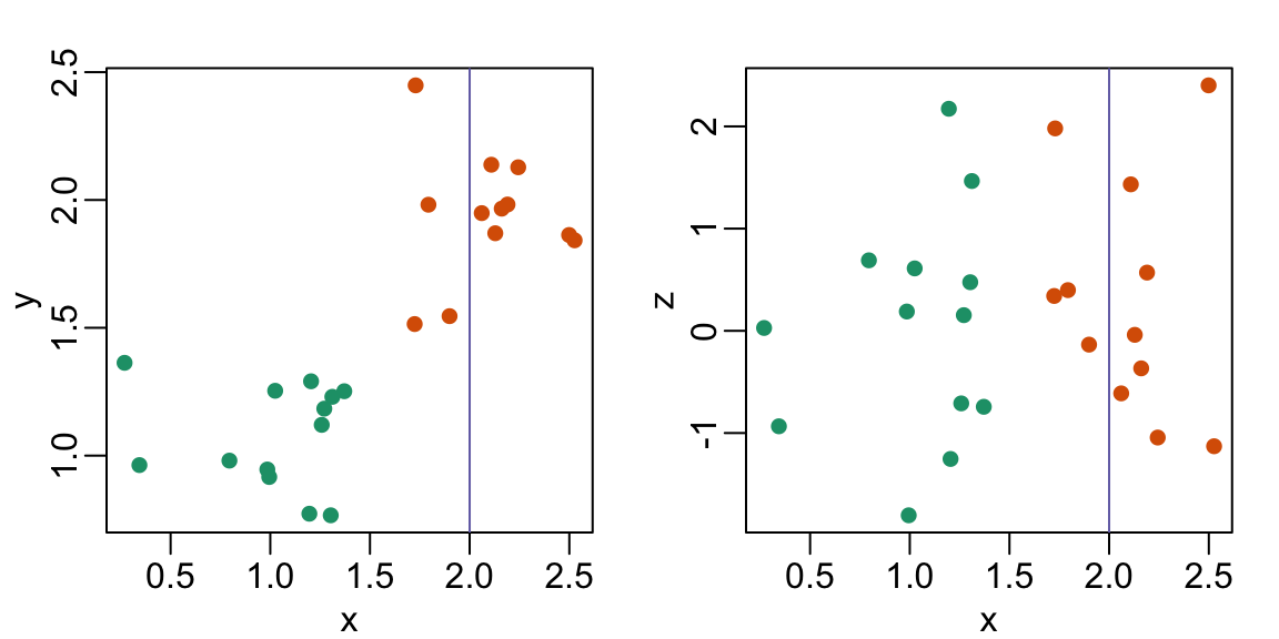
The line (x=2) appears to separate the points. But it is actually not the case, which we can see by plotting the data in a couple of two-dimensional points.
Why is this happening?
- Humans are not good at reading pseudo-3D plots.
- There must be an error in the code.
- The colors confuse us.
- Scatterplots should not be used to compare two variables when we have access to 3.