We can change the color of the points using the col argument in the
geom_point function. To facilitate demonstration of new features, we
will redefine p to be everything except the points layer:
p <-  murders %>% ggplot(aes(population/10^6, total, label = abb)) +
  geom_text(nudge_x = 0.05) +
  scale_x_log10() +
  scale_y_log10() +
  xlab("Populations in millions (log scale)") +
  ylab("Total number of murders (log scale)") +
  ggtitle("US Gun Murders in 2010")
and then test out what happens by adding different calls to
geom_point. We can make all the points blue by adding the color
argument:
p + geom_point(size = 3, color ="blue")
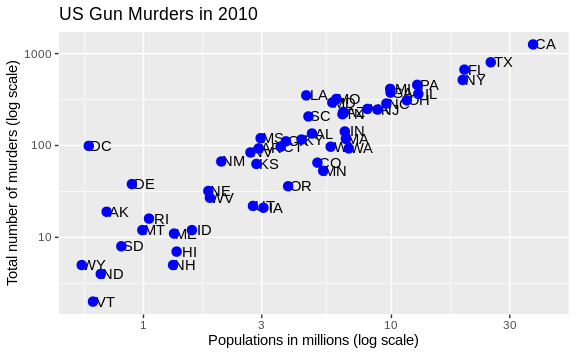
This, of course, is not what we want. We want to assign color depending on the geographical region. A nice default behavior of ggplot2 is that if we assign a categorical variable to color, it automatically assigns a different color to each category and also adds a legend.
Since the choice of color is determined by a feature of each
observation, this is an aesthetic mapping. To map each point to a color,
we need to use aes. We use the following code:
p + geom_point(aes(col=region), size = 3)
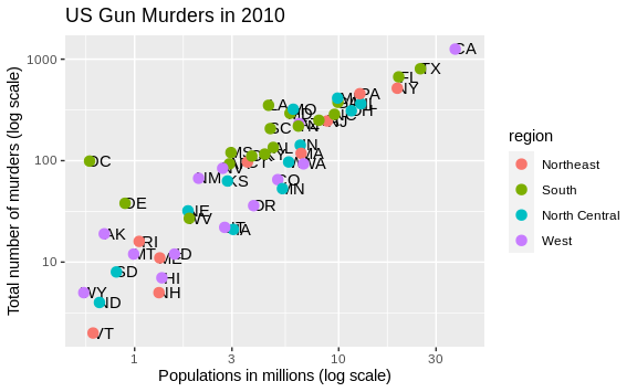
The x and y mappings are inherited from those already defined in
p, so we do not redefine them. We also move aes to the first
argument since that is where mappings are expected in this function
call.
Here we see yet another useful default behavior: ggplot2
automatically adds a legend that maps color to region. To avoid adding
this legend we set the geom_point argument show.legend = FALSE.