A systematic way to assess how well the normal distribution fits the data is to check if the observed and predicted proportions match. In general, this is the approach of the quantile-quantile plot (QQ-plot).
First let’s define the theoretical quantiles for the normal
distribution. In statistics books we use the symbol \(\Phi(x)\) to
define the function that gives us the probability of a standard normal
distribution being smaller than \(x\). So, for example,
\(\Phi(-1.96) = 0.025\) and \(\Phi(1.96) = 0.975\). In R, we can
evaluate \(\Phi\) using the pnorm function:
pnorm(-1.96)
#> [1] 0.025
The inverse function \(\Phi^{-1}(x)\) gives us the theoretical
quantiles for the normal distribution. So, for example,
\(\Phi^{-1}(0.975) = 1.96\). In R, we can evaluate the inverse of
\(\Phi\) using the qnorm function.
qnorm(0.975)
#> [1] 1.96
Note that these calculations are for the standard normal distribution by
default (mean = 0, standard deviation = 1), but we can also define these
for any normal distribution. We can do this using the mean and sd
arguments in the pnorm and qnorm function. For example, we can use
qnorm to determine quantiles of a distribution with a specific average
and standard deviation
qnorm(0.975, mean = 5, sd = 2)
#> [1] 8.92
For the normal distribution, all the calculations related to quantiles
are done without data, thus the name theoretical quantiles. But
quantiles can be defined for any distribution, including an empirical
one. So if we have data in a vector \(x\), we can define the quantile
associated with any proportion \(p\) as the \(q\) for which the
proportion of values below \(q\) is \(p\). Using R code, we can define
q as the value for which mean(x <= q) = p. Notice that not all \(p\)
have a \(q\) for which the proportion is exactly \(p\). There are
several ways of defining the best \(q\) as discussed in the help for the
quantile function.
To give a quick example, for the male heights data, we have that:
mean(x <= 69.5)
#> [1] 0.515
So about 50% are shorter or equal to 69 inches. This implies that if \(p=0.50\) then \(q=69.5\).
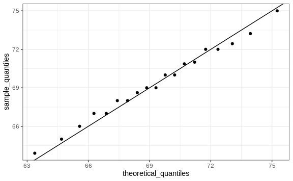
The idea of a QQ-plot is that if your data is well approximated by normal distribution then the quantiles of your data should be similar to the quantiles of a normal distribution. To construct a QQ-plot, we do the following:
- Define a vector of \(m\) proportions \(p_1, p_2, \dots, p_m\).
- Define a vector of quantiles \(q_1, \dots, q_m\) for your data for the proportions \(p_1, \dots, p_m\). We refer to these as the sample quantiles.
- Define a vector of theoretical quantiles for the proportions \(p_1, \dots, p_m\) for a normal distribution with the same average and standard deviation as the data.
- Plot the sample quantiles versus the theoretical quantiles.
Let’s construct a QQ-plot using R code. Start by defining the vector of proportions.
p <- seq(0.05, 0.95, 0.05)
To obtain the quantiles from the data, we can use the quantile
function like this:
sample_quantiles <- quantile(x, p)
To obtain the theoretical normal distribution quantiles with the
corresponding average and SD, we use the qnorm function:
theoretical_quantiles <- qnorm(p, mean = mean(x), sd = sd(x))
To see if they match or not, we plot them against each other and draw the identity line:
qplot(theoretical_quantiles, sample_quantiles) + geom_abline()
Notice that this code becomes much cleaner if we use standard units:
sample_quantiles <- quantile(z, p)
theoretical_quantiles <- qnorm(p)
qplot(theoretical_quantiles, sample_quantiles) + geom_abline()
The above code is included to help describe QQ-plots. However, in practice it is easier to use the ggplot2 code described in Section 8.16:
heights %>% filter(sex == "Male") %>%
  ggplot(aes(sample = scale(height))) +
  geom_qq() +
  geom_abline()
While for the illustration above we used 20 quantiles, the default from
the geom_qq function is to use as many quantiles as data points.