In Chapter 7, we introduced the ggplot2 package for data visualization. Here we demonstrate how to generate plots related to distributions, specifically the plots shown earlier in this chapter.
Barplots
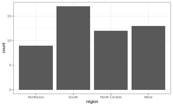
To generate a barplot we can use the geom_bar geometry. The default is
to count the number of each category and draw a bar. Here is the plot
for the regions of the US.
murders %>% ggplot(aes(region)) + geom_bar()
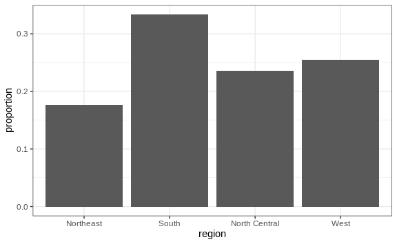
We often already have a table with a distribution that we want to present as a barplot. Here is an example of such a table:
data(murders)
tab <- murders %>%
  count(region) %>%
  mutate(proportion = n/sum(n))
tab
#>          region  n proportion
#> 1     Northeast  9      0.176
#> 2         South 17      0.333
#> 3 North Central 12      0.235
#> 4          West 13      0.255
We no longer want geom_bar to count, but rather just plot a bar to the
height provided by the proportion variable. For this we need to
provide x (the categories) and y (the values) and use the
stat="identity" option.
tab %>% ggplot(aes(region, proportion)) + geom_bar(stat = "identity")
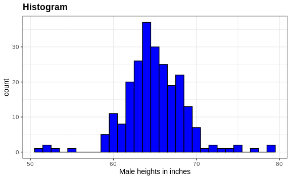
Histograms
To generate histograms we use geom_histogram. By looking at the help
file for this function, we learn that the only required argument is x,
the variable for which we will construct a histogram. We dropped the x
because we know it is the first argument. The code looks like this:
heights %>%
  filter(sex == "Female") %>%
  ggplot(aes(height)) +
  geom_histogram()
If we run the code above, it gives us a message:
stat_bin()usingbins = 30. Pick better value withbinwidth.
We previously used a bin size of 1 inch, so the code looks like this:
heights %>%
  filter(sex == "Female") %>%
  ggplot(aes(height)) +
  geom_histogram(binwidth = 1)
Finally, if for aesthetic reasons we want to add color, we use the arguments described in the help file. We also add labels and a title:
heights %>%
  filter(sex == "Female") %>%
  ggplot(aes(height)) +
  geom_histogram(binwidth = 1, fill = "blue", col = "black") +
  xlab("Male heights in inches") +
  ggtitle("Histogram")
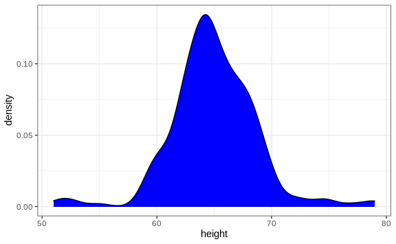
Density plots
To create a smooth density, we use the geom_density. To make a smooth
density plot with the data previously shown as a histogram we can use
this code:
heights %>%
  filter(sex == "Female") %>%
  ggplot(aes(height)) +
  geom_density()
To fill in with color, we can use the fill argument.
heights %>%
  filter(sex == "Female") %>%
  ggplot(aes(height)) +
  geom_density(fill="blue")
To change the smoothness of the density, we use the adjust argument to
multiply the default value by that adjust. For example, if we want the
bandwidth to be twice as big we use:
heights %>%
  filter(sex == "Female") +
  geom_density(fill="blue", adjust = 2)
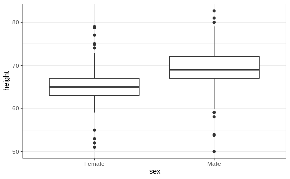
Boxplots
The geometry for boxplot is geom_boxplot. As discussed, boxplots are
useful for comparing distributions. For example, below are the
previously shown heights for women, but compared to men. For this
geometry, we need arguments x as the categories, and y as the
values.
heights %>%
  ggplot(aes(x=sex, y=height)) +
  geom_boxplot()
QQ-plots
For qq-plots we use the geom_qq geometry. From the help file, we learn
that we need to specify the sample (we will learn about samples in a
later chapter). Here is the qqplot for men heights.
heights %>% filter(sex=="Male") %>%
  ggplot(aes(sample = height)) +
  geom_qq() +
  geom_qq_line()
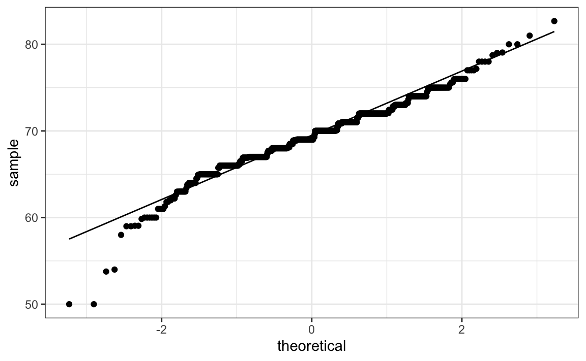
By default, the sample variable is compared to a normal distribution
with average 0 and standard deviation 1. To change this, we use the
dparams arguments based on the help file. Adding an identity line is
as simple as assigning another layer. For straight lines, we use the
geom_abline function. The default line is the identity line (slope =
1, intercept = 0).
params <- heights %>% filter(sex=="Male") %>%
  summarize(mean = mean(height), sd = sd(height))

heights %>% filter(sex=="Male") %>%
  ggplot(aes(sample = height)) +
  geom_qq(dparams = params) +
  geom_abline()
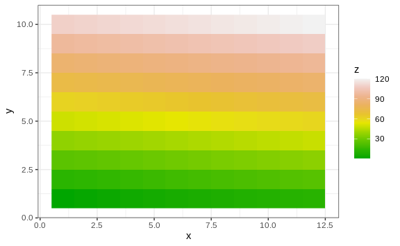
Images
Images were not needed for the concepts described in this chapter, but we will use images in Section 10.14, so we introduce the two geometries used to create images: geom_tile and geom_raster. They behave similarly; to see how they differ, please consult the help file. To create an image in ggplot2 we need a data frame with the x and y coordinates as well as the values associated with each of these. Here is a data frame.
x <- expand.grid(x = 1:12, y = 1:10) %>%
  mutate(z = 1:120)
Note that this is the tidy version of a matrix, matrix(1:120, 12, 10).
To plot the image we use the following code:
x %>% ggplot(aes(x, y, fill = z)) +
  geom_raster()
With these images you will often want to change the color scale. This
can be done through the scale_fill_gradientn layer.
x %>% ggplot(aes(x, y, fill = z)) +
  geom_raster() +
  scale_fill_gradientn(colors =  terrain.colors(10))
Quick plots
In Section 7.13 we introduced qplot as a useful
function when we need to make a quick scatterplot. We can also use
qplot to make histograms, density plots, boxplot, qqplots and more.
Although it does not provide the level of control of ggplot, qplot
is definitely useful as it permits us to make a plot with a short
snippet of code.
Suppose we have the female heights in an object x:
x <- heights %>%
  filter(sex=="Male") %>%
  pull(height)
To make a quick histogram we can use:
qplot(x)
The function guesses that we want to make a histogram because we only
supplied one variable. In Section 7.13 we saw that
if we supply qplot two variables, it automatically makes a
scatterplot.
To make a quick qqplot you have to use the sample argument. Note that
we can add layers just as we do with ggplot.
qplot(sample = scale(x)) + geom_abline()
If we supply a factor and a numeric vector, we obtain a plot like the
one below. Note that in the code below we are using the data argument.
Because the data frame is not the first argument in qplot, we have to
use the dot operator.
heights %>% qplot(sex, height, data = .)
We can also select a specific geometry by using the geom argument. So
to convert the plot above to a boxplot, we use the following code:
heights %>% qplot(sex, height, data = ., geom = "boxplot")
We can also use the geom argument to generate a density plot instead
of a histogram:
qplot(x, geom = "density")
Although not as much as with ggplot, we do have some flexibility to
improve the results of qplot. Looking at the help file we see several
ways in which we can improve the look of the histogram above. Here is an
example:
qplot(x, bins=15, color = I("black"), xlab = "Population")
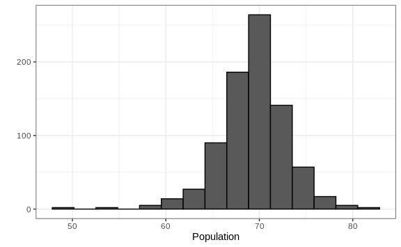
Technical note: The reason we use I("black") is because we want
qplot to treat "black" as a character rather than convert it to a
factor, which is the default behavior within aes, which is internally
called here. In general, the function I is used in R to say “keep it
as it is”.