In this exercise, we will work further with the text of the samsung tweets, that we acquired in the previous exercise.
Creating word graphs
First, we will remove special characters.
text <- iconv(text,'latin1', 'ascii', sub = '')
STEP 1: Create document by term matrix
We create a function for the creation of a dtm.
create_document_term_matrix <- function(data){

  p_load(SnowballC, tm)
  myCorpus <- Corpus(VectorSource(data))

  cat("Transform to lower case \n")
  myCorpus <- tm_map(myCorpus, content_transformer(tolower))

  cat("Remove punctuation \n")
  myCorpus <- tm_map(myCorpus, removePunctuation)

  cat("Remove numbers \n")
  myCorpus <- tm_map(myCorpus, removeNumbers)

  cat("Remove stopwords \n")
  myStopwords <- c(stopwords('english'))
  myCorpus <- tm_map(myCorpus, removeWords, myStopwords)

  # cat("Stem corpus \n")
  # myCorpus = tm_map(myCorpus, stemDocument);
  # myCorpus = tm_map(myCorpus, stemCompletion, dictionary=dictCorpus);

  cat("Create document by term matrix \n")
  myDtm <- DocumentTermMatrix(myCorpus, control = list(wordLengths = c(2, Inf)))
  myDtm
}
Next, we can use the created function on the samsung tweets and investigate the output. Notice that we create a tf matrix and not a tf-idf, because we want to create an adjacency matrix.
doc_term_mat <- create_document_term_matrix(text)
doc_term_mat
<<DocumentTermMatrix (documents: 198, terms: 1115)>>
Non-/sparse entries: 3502/217268
Sparsity           : 98%
Maximal term length: 29
Weighting          : term frequency (tf)
STEP 2: Create adjacency matrix
In a second step, we create a function to create the adjacency matrix.
create_adjacency_matrix <- function(object, probs=0.99){

  #object = output from function create_document_term_matrix (a document by term matrix)
  #probs = select only vertexes with degree greater than or equal to quantile given by the value of probs

  cat("Create adjacency matrix \n")
  p_load(sna)

  mat <- as.matrix(object)
  mat[mat >= 1] <- 1 #change to boolean (adjacency) matrix
  Z <- t(mat) %*% mat

  cat("Apply filtering \n")
  ind <- sna::degree(as.matrix(Z),cmode = "indegree") >= quantile(sna::degree(as.matrix(Z),cmode = "indegree"),probs=0.99)
  #ind <- sna::betweenness(as.matrix(Z)) >= quantile(sna::betweenness(as.matrix(Z)),probs=0.99)

  Z <- Z[ind,ind]

  cat("Resulting adjacency matrix has ",ncol(Z)," rows and columns \n")
  dim(Z)
  list(Z=Z,termbydocmat=object,ind=ind)
}
We again apply the created function on the samsung tweets and we investigate the result.
adj_mat <- create_adjacency_matrix(doc_term_mat)
adj_mat[[1]][1:5,1:5]
         Terms
Terms     samsung galaxy will apply contest
  samsung     198     79   38    33      29
  galaxy       79     79    6     1       0
  will         38      6   38    27      27
  apply        33      1   27    33      28
  contest      29      0   27    28      29
STEP 3: Run this multiple times until you are satisfied
In a final step, we create a function to simplify the plotting.
See lecture 1 to know why this changes with each execution.
plot_network <- function(object){
#Object: output from the create_adjacency_matrix function
#Create graph from adjacency matrix
p_load(igraph)
g <- graph.adjacency(object$Z, weighted=TRUE, mode ='undirected')
g <- simplify(g)
#Set labels and degrees of vertices
V(g)$label <- V(g)$name
V(g)$degree <- igraph::degree(g)
layout <- layout.auto(g)
opar <- par()$mar; par(mar=rep(0, 4)) #Give the graph lots of room
#Adjust the widths of the edges and add distance measure labels
#Use 1 - binary (?dist) a proportion distance of two vectors
#The binary distance (or Jaccard distance) measures the dissimilarity, so 1 is perfect and 0 is no overlap (using 1 - binary)
edge.weight <- 7 #A maximizing thickness constant
z1 <- edge.weight*(1-dist(t(object$termbydocmat)[object$ind,], method="binary"))
E(g)$width <- c(z1)[c(z1) != 0] #Remove 0s: these won't have an edge
clusters <- spinglass.community(g)
cat("Clusters found: ", length(clusters$csize),"\n")
cat("Modularity: ", clusters$modularity,"\n")
plot(g, layout=layout, vertex.color=rainbow(4)[clusters$membership], vertex.frame.color=rainbow(4)[clusters$membership] )
}
options(warn=-1)
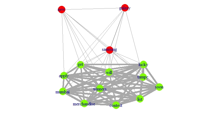
plot_network(adj_mat)
options(warn=0)
Clusters found: 2
Modularity: 0.02724781
Applying this function on the samsung data results in the following graph. The different colors denote the different communities, while the thickness of the edges (lines) denotes the strength of the connection.
Exercise
Perform steps 1, 2, and 3 on the apple dataset and store it
as doc_term_mat, adj_mat, and plot_adj_mat, respectively.
Do not remove special characters from the text.
To download the apple dataset click
here1.
Assume that:
- The
appledataset is given. - The
doc_term_mat,adj_mat, andplot_networkfunctions are given. - The pacman, tm, wordcloud, and wordcloud2 packages are loaded.