The summary() function also returns \(R^2\), \(RSS\), adjusted \(R^2\), \(C_p\), and \(BIC\).
We can examine these to try to select the best overall model.
> names(reg.summary)
[1] "which"  "rsq"    "rss"    "adjr2"  "cp"     "bic"
[7] "outmat" "obj"
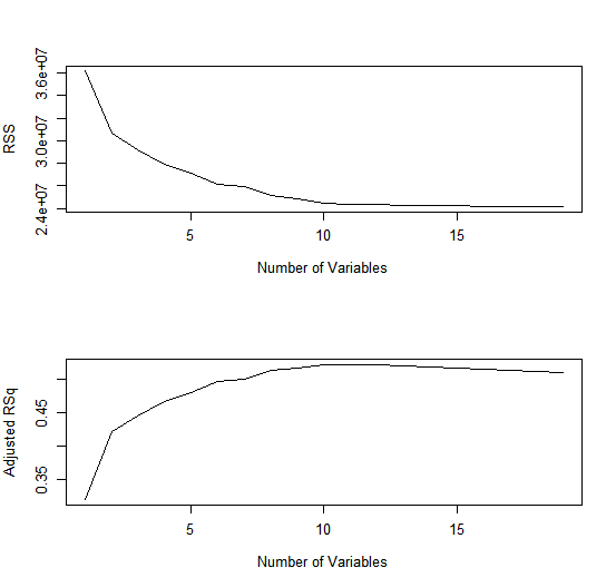
For instance, we see that the \(R^2\) statistic increases from 32%, when only one variable is included in the model, to almost 55 %, when all variables are included. As expected, the \(R^2\) statistic increases monotonically as more variables are included.
> reg.summary$rsq
 [1] 0.3214501 0.4252237 0.4514294 0.4754067 0.4908036
 [6] 0.5087146 0.5141227 0.5285569 0.5346124 0.5404950
[11] 0.5426153 0.5436302 0.5444570 0.5452164 0.5454692
[16] 0.5457656 0.5459518 0.5460945 0.5461159
Plotting \(RSS\), adjusted \(R^2\), \(C_p\) and \(BIC\) for all of the models at once will
help us decide which model to select. Note the type="l" option tells R to
connect the plotted points with lines.
par(mfrow = c(2, 1))
plot(reg.summary$rss, xlab = "Number of Variables", ylab = "RSS", type = "l")
plot(reg.summary$adjr2, xlab = "Number of Variables", ylab = "Adjusted RSq", type = "l")
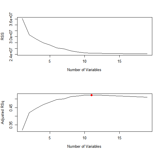
The points() command works like the plot() command, except that it
puts points on a plot that has already been created, instead of creating a
new plot. The which.max() function can be used to identify the location of
the maximum point of a vector. We will now plot a red dot to indicate the
model with the largest adjusted \(R^2\) statistic.
which.max(reg.summary$adjr2)
[1] 11
points(11, reg.summary$adjr2[11], col = "red", cex = 2, pch = 20)
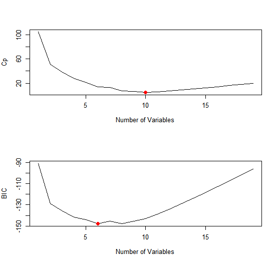
In a similar fashion we can plot the \(C_p\) and \(BIC\) statistics, and indicate the
models with the smallest statistic using which.min().
plot(reg.summary$cp, xlab = "Number of Variables", ylab = "Cp", type = 'l')
which.min(reg.summary$cp)
[1] 10
points(10, reg.summary$cp[10], col = "red", cex = 2, pch = 20)
which.min(reg.summary$bic)
[1] 6
plot(reg.summary$bic, xlab = "Number of Variables", ylab = "BIC", type = 'l')
points(6, reg.summary$bic[6], col = "red", cex = 2, pch = 20)
The regsubsets() function has a built-in plot() command which can
be used to display the selected variables for the best model with a given
number of predictors, ranked according to the \(C_p\), \(BIC\), adjusted \(R^2\), or
\(AIC\). To find out more about this function, type ?plot.regsubsets.
par(mfrow = c(2, 2))
plot(regfit.full, scale = "r2")
plot(regfit.full, scale = "adjr2")
plot(regfit.full, scale = "Cp")
plot(regfit.full, scale = "bic")
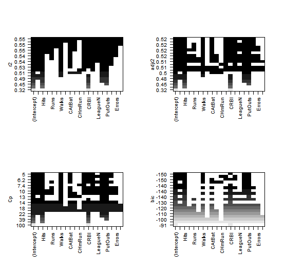
The top row of each plot contains a black square for each variable selected
according to the optimal model associated with that statistic. For instance,
we see that several models share a \(BIC\) close to −150. However, the model
with the lowest BIC is the six-variable model that contains only AtBat,
Hits, Walks, CRBI, DivisionW, and PutOuts. We can use the coef() function
to see the coefficient estimates associated with this model.
> coef(regfit.full, 6)
 (Intercept)        AtBat         Hits        Walks
  91.5117981   -1.8685892    7.6043976    3.6976468
        CRBI    DivisionW      PutOuts
   0.6430169 -122.9515338    0.2643076
MC1:
A) When adding additional predictors to a model the \(R^2\) will keep increasing monotonically
B) When adding additional predictors to a model the \(\bar R^2\) (adjusted \(R^2\)) will keep increasing monotonically
- 1) Both statements are true.
- 2) Both statements are false.
- 3) A is true and B is false.
- 4) A is false and B is true.
MC2:
A) If we purely focus on \(C_p\), then we can conclude that the model with 11 predictors is ideal
B) If we purely focus on \(BIC\), then we can conclude that the model with 6 predictors is ideal
- 1) Both statements are true.
- 2) Both statements are false.
- 3) A is true and B is false.
- 4) A is false and B is true.