To introduce boxplots we will go back to the US murder data. Suppose we want to summarize the murder rate distribution. Using the data visualization technique we have learned, we can quickly see that the normal approximation does not apply here:

In this case, the histogram above or a smooth density plot would serve as a relatively succinct summary.
Now suppose those used to receiving just two numbers as summaries ask us for a more compact numerical summary.
Here Tukey offered some advice. Provide a five-number summary composed of the range along with the quartiles (the 25th, 50th, and 75th percentiles). Tukey further suggested that we ignore outliers when computing the range and instead plot these as independent points. We provide a detailed explanation of outliers later. Finally, he suggested we plot these numbers as a “box” with “whiskers” like this:
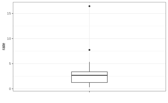
with the box defined by the 25% and 75% percentile and the whiskers showing the range. The distance between these two is called the interquartile range. The two points are outliers according to Tukey’s definition. The median is shown with a horizontal line. Today, we call these boxplots.
From just this simple plot, we know that the median is about 2.5, that the distribution is not symmetric, and that the range is 0 to 5 for the great majority of states with two exceptions.
We discuss how to make boxplots in Section 8.16.