Smooth density plots are aesthetically more appealing than histograms. Here is what a smooth density plot looks like for our heights data:

In this plot, we no longer have sharp edges at the interval boundaries and many of the local peaks have been removed. Also, the scale of the y-axis changed from counts to density.
To understand the smooth densities, we have to understand estimates, a topic we don’t cover until later. However, we provide a heuristic explanation to help you understand the basics so you can use this useful data visualization tool.
The main new concept you must understand is that we assume that our list of observed values is a subset of a much larger list of unobserved values. In the case of heights, you can imagine that our list of 812 male students comes from a hypothetical list containing all the heights of all the male students in all the world measured very precisely. Let’s say there are 1,000,000 of these measurements. This list of values has a distribution, like any list of values, and this larger distribution is really what we want to report to ET since it is much more general. Unfortunately, we don’t get to see it.
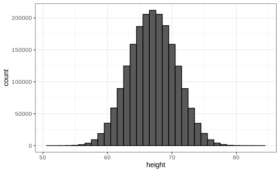
However, we make an assumption that helps us perhaps approximate it. If we had 1,000,000 values, measured very precisely, we could make a histogram with very, very small bins. The assumption is that if we show this, the height of consecutive bins will be similar. This is what we mean by smooth: we don’t have big jumps in the heights of consecutive bins. Below we have a hypothetical histogram with bins of size 1:
The smaller we make the bins, the smoother the histogram gets. Here are the histograms with bin width of 1, 0.5, and 0.1:

The smooth density is basically the curve that goes through the top of the histogram bars when the bins are very, very small. To make the curve not depend on the hypothetical size of the hypothetical list, we compute the curve on frequencies rather than counts:

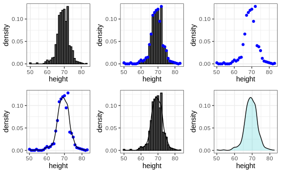
Now, back to reality. We don’t have millions of measurements. Instead, we have 812 and we can’t make a histogram with very small bins.
We therefore make a histogram, using bin sizes appropriate for our data and computing frequencies rather than counts, and we draw a smooth curve that goes through the tops of the histogram bars. The following plots demonstrate the steps that lead to a smooth density:
However, remember that smooth is a relative term. We can actually control the smoothness of the curve that defines the smooth density through an option in the function that computes the smooth density curve. Here are two examples using different degrees of smoothness on the same histogram:

We need to make this choice with care as the resulting visualizations can change our interpretation of the data. We should select a degree of smoothness that we can defend as being representative of the underlying data. In the case of height, we really do have reason to believe that the proportion of people with similar heights should be the same. For example, the proportion that is 72 inches should be more similar to the proportion that is 71 than to the proportion that is 78 or 65. This implies that the curve should be pretty smooth; that is, the curve should look more like the example on the right than on the left.
While the histogram is an assumption-free summary, the smoothed density is based on some assumptions.
Interpreting the y-axis
Note that interpreting the y-axis of a smooth density plot is not straightforward. It is scaled so that the area under the density curve adds up to 1. If you imagine we form a bin with a base 1 unit in length, the y-axis value tells us the proportion of values in that bin. However, this is only true for bins of size 1. For other size intervals, the best way to determine the proportion of data in that interval is by computing the proportion of the total area contained in that interval. For example, here are the proportion of values between 65 and 68:
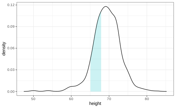
The proportion of this area is about 0.3, meaning that about 30% of male heights are between 65 and 68 inches.
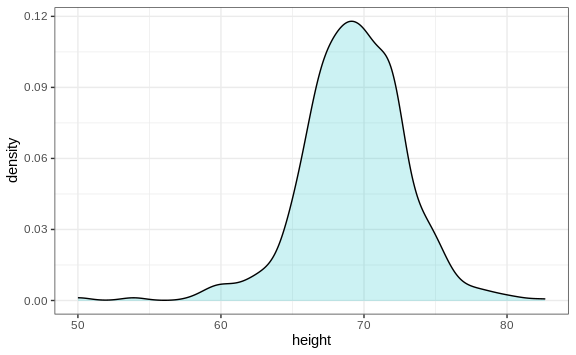
By understanding this, we are ready to use the smooth density as a summary. For this dataset, we would feel quite comfortable with the smoothness assumption, and therefore with sharing this aesthetically pleasing figure with ET, which he could use to understand our male heights data:
Densities permit stratification
As a final note, we point out that an advantage of smooth densities over histograms for visualization purposes is that densities make it easier to compare two distributions. This is in large part because the jagged edges of the histogram add clutter. Here is an example comparing male and female heights:

With the right argument, ggplot automatically shades the intersecting
region with a different color. We will show examples of ggplot2 code
for densities in Section 9 as well as Section
8.16.