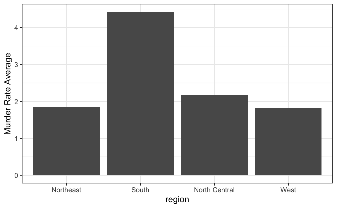
Say we are interested in comparing gun homicide rates across regions of the US. We see this plot below.
library(dslabs)
data("murders")
murders %>% mutate(rate = total/population*100000) %>%
group_by(region) %>%
summarize(avg = mean(rate)) %>%
mutate(region = factor(region)) %>%
ggplot(aes(region, avg)) +
geom_bar(stat="identity") +
ylab("Murder Rate Average")

1. We decided to move to a state in the western region. What is the main problem with this interpretation? Store your answer in q1.
- The categories are ordered alphabetically.
- The graph does not show standarad errors.
- It does not show all the data. We do not see the variability within a region and it’s possible that the safest states are not in the West.
- The Northeast has the lowest average.
2. Make a boxplot of the murder rates defined as
data("murders")
murders %>% mutate(rate = total/population*100000)
by region, showing all the points and ordering the regions by their
median rate. Store the resulting ggplot object in p.