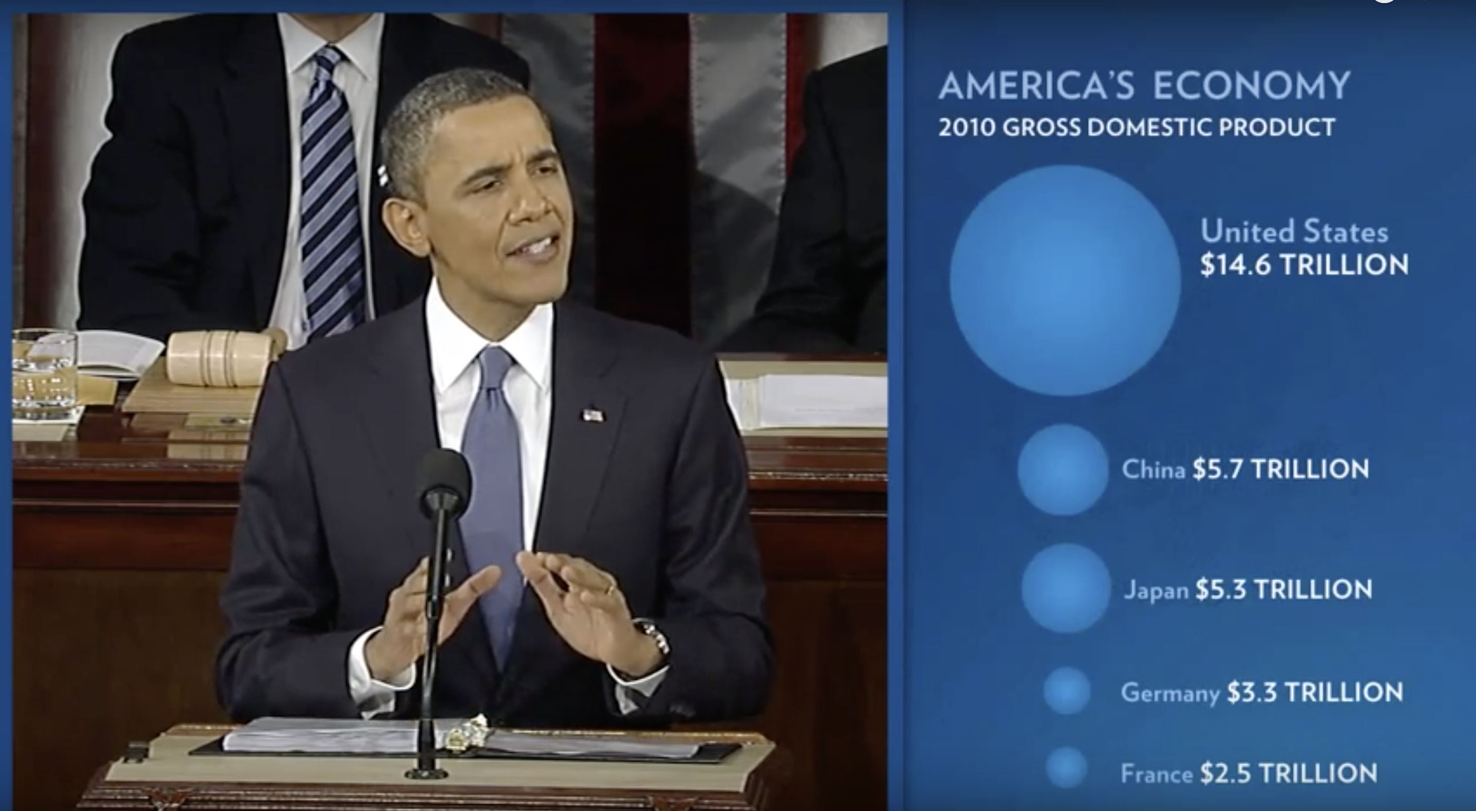
During President Barack Obama’s 2011 State of the Union Address, the following chart was used to compare the US GDP to the GDP of four competing nations:
 (Source: The 2011 State of the Union Address (link))
Judging by the area of the circles, the US appears to have an economy over five times larger than China’s and over 30 times larger than France’s. However, if we look at the actual numbers, we see that this is not the case. The actual ratios are 2.6 and 5.8 times bigger than China and France, respectively. The reason for this distortion is that the radius, rather than the area, was made to be proportional to the quantity, which implies that the proportion between the areas is squared: 2.6 turns into 6.5 and 5.8 turns into 34.1. Here is a comparison of the circles we get if we make the value proportional to the radius and to the area:

Not surprisingly, ggplot2 defaults to using area rather than radius. Of course, in this case, we really should not be using area at all since we can use position and length:
