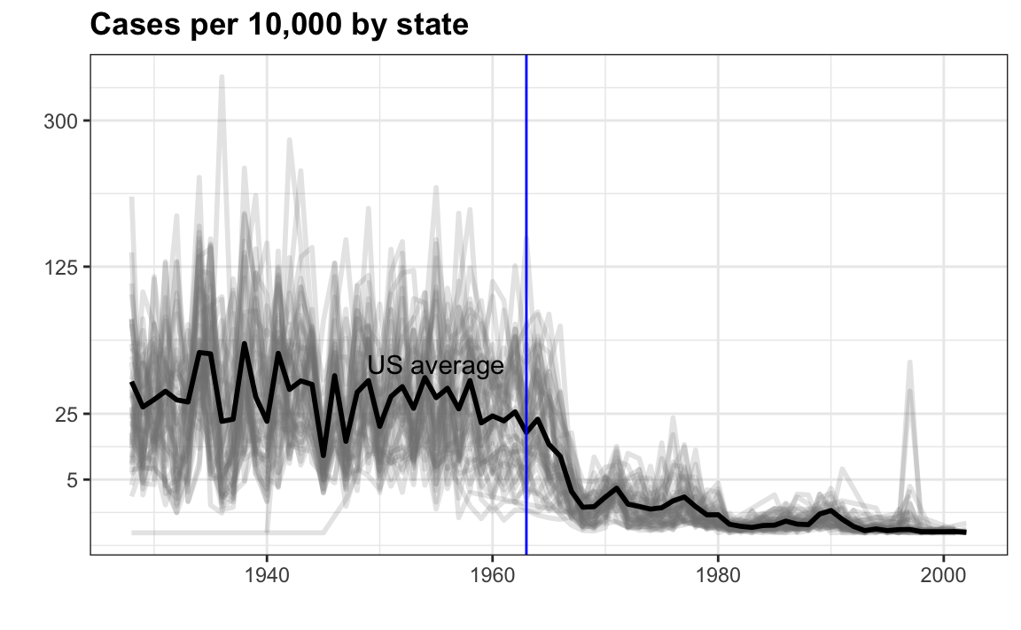
In the previous section we made the following plot:
the_disease <- "Measles"
dat <- us_contagious_diseases %>%
  filter(!state%in%c("Hawaii","Alaska") & disease == the_disease) %>%
  mutate(rate = count / population * 10000 * 52 / weeks_reporting) %>%
  mutate(state = reorder(state, rate))

avg <- dat %>%
  group_by(year) %>%
  summarize(us_rate = sum(count * 52 / weeks_reporting, na.rm = TRUE) /
              sum(population, na.rm = TRUE) * 10000)

dat %>%
  filter(!is.na(rate)) %>%
    ggplot() +
  geom_line(aes(year, rate, group = state),  color = "grey50",
            show.legend = FALSE, alpha = 0.2, size = 1) +
  geom_line(mapping = aes(year, us_rate),  data = avg, size = 1) +
  scale_y_continuous(trans = "sqrt", breaks = c(5, 25, 125, 300)) +
  ggtitle("Cases per 10,000 by state") +
  xlab("") + ylab("") +
  geom_text(data = data.frame(x = 1955, y = 50),
            mapping = aes(x, y, label="US average"),
            color="black") +
  geom_vline(xintercept=1963, col = "blue")
Now reproduce this plot but for smallpox. For this plot, do not include years in which cases were reported in less than 10 weeks. Remove the geom_text and geom_vline layers from the plot. Store the resulting data frame in dat as done in the example. Store the resulting ggplot object in p.