The reason for this stems from the preconceived notion that the world is divided into two groups: the western world (Western Europe and North America), characterized by long life spans and small families, versus the developing world (Africa, Asia, and Latin America) characterized by short life spans and large families. But do the data support this dichotomous view?
The necessary data to answer this question is also available in our
gapminder table. Using our newly learned data visualization skills, we
will be able to tackle this challenge.
In order to analyze this world view, our first plot is a scatterplot of life expectancy versus fertility rates (average number of children per woman). We start by looking at data from about 50 years ago, when perhaps this view was first cemented in our minds.
filter(gapminder, year == 1962) %>%
  ggplot(aes(fertility, life_expectancy)) +
  geom_point()
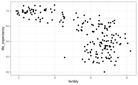
Most points fall into two distinct categories:
- Life expectancy around 70 years and 3 or fewer children per family.
- Life expectancy lower than 65 years and more than 5 children per family.
To confirm that indeed these countries are from the regions we expect, we can use color to represent continent.
filter(gapminder, year == 1962) %>%
  ggplot( aes(fertility, life_expectancy, color = continent)) +
  geom_point()
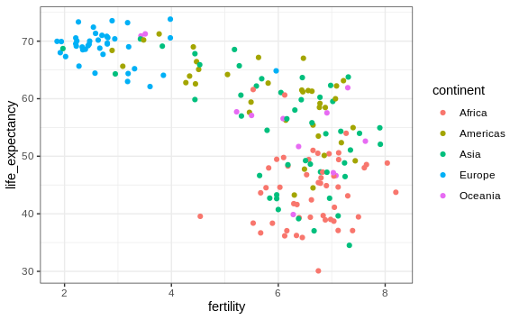
In 1962, “the West versus developing world” view was grounded in some reality. Is this still the case 50 years later?