We could easily plot the 2012 data in the same way we did for 1962. To make comparisons, however, side by side plots are preferable. In ggplot2, we can achieve this by faceting variables: we stratify the data by some variable and make the same plot for each strata.
To achieve faceting, we add a layer with the function facet_grid,
which automatically separates the plots. This function lets you facet by
up to two variables using columns to represent one variable and rows to
represent the other. The function expects the row and column variables
to be separated by a ~. Here is an example of a scatterplot with
facet_grid added as the last layer:
filter(gapminder, year%in%c(1962, 2012)) %>%
  ggplot(aes(fertility, life_expectancy, col = continent)) +
  geom_point() +
  facet_grid(continent~year)

We see a plot for each continent/year pair. However, this is just an example and more than what we want, which is simply to compare 1962 and
- In this case, there is just one variable and we use
.to let facet know that we are not using one of the variables:
filter(gapminder, year%in%c(1962, 2012)) %>%
  ggplot(aes(fertility, life_expectancy, col = continent)) +
  geom_point() +
  facet_grid(. ~ year)
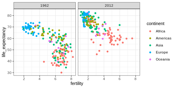
This plot clearly shows that the majority of countries have moved from the developing world cluster to the western world one. In 2012, the western versus developing world view no longer makes sense. This is particularly clear when comparing Europe to Asia, the latter of which includes several countries that have made great improvements.
facet_wrap
To explore how this transformation happened through the years, we can
make the plot for several years. For example, we can add 1970, 1980,
1990, and 2000. If we do this, we will not want all the plots on the
same row, the default behavior of facet_grid, since they will become
too thin to show the data. Instead, we will want to use multiple rows
and columns. The function facet_wrap permits us to do this by
automatically wrapping the series of plots so that each display has
viewable dimensions:
years <- c(1962, 1980, 1990, 2000, 2012)
continents <- c("Europe", "Asia")
gapminder %>%
  filter(year %in% years & continent %in% continents) %>%
  ggplot( aes(fertility, life_expectancy, col = continent)) +
  geom_point() +
  facet_wrap(~year)
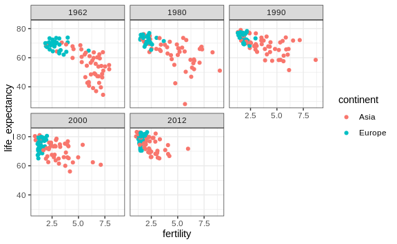
This plot clearly shows how most Asian countries have improved at a much faster rate than European ones.
Fixed scales for better comparisons
The default choice of the range of the axes is important. When not using
facet, this range is determined by the data shown in the plot. When
using facet, this range is determined by the data shown in all plots
and therefore kept fixed across plots. This makes comparisons across
plots much easier. For example, in the above plot, we can see that life
expectancy has increased and the fertility has decreased across most
countries. We see this because the cloud of points moves. This is not
the case if we adjust the scales:
filter(gapminder, year%in%c(1962, 2012)) %>%
  ggplot(aes(fertility, life_expectancy, col = continent)) +
  geom_point() +
  facet_wrap(. ~ year, scales = "free")
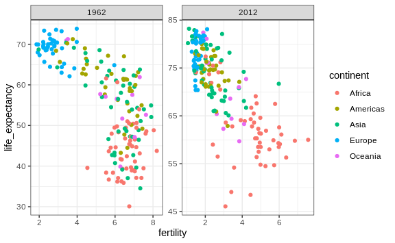
In the plot above, we have to pay special attention to the range to notice that the plot on the right has a larger life expectancy.