In Chapter 7 we describe an add-on package that provides a powerful approach to producing plots in R. We then have an entire part on Data Visualization in which we provide many examples. Here we briefly describe some of the functions that are available in a basic R installation.
plot
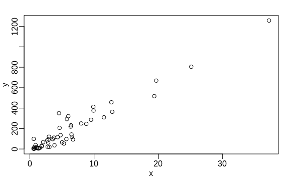
The plot function can be used to make scatterplots. Here is a plot of
total murders versus population.
x <- murders$population / 10^6
y <- murders$total
plot(x, y)
For a quick plot that avoids accessing variables twice, we can use the
with function:
with(murders, plot(population, total))
The function with lets us use the murders column names in the plot
function. It also works with any data frames and any function.
hist
We will describe histograms as they relate to distributions in the Data Visualization part of the book. Here we will simply note that histograms are a powerful graphical summary of a list of numbers that gives you a general overview of the types of values you have. We can make a histogram of our murder rates by simply typing:
x <- with(murders, total / population * 100000)
hist(x)
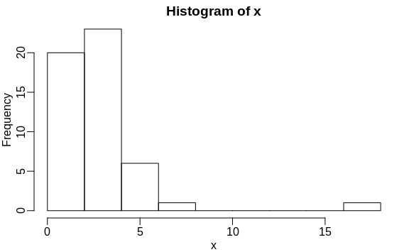
We can see that there is a wide range of values with most of them between 2 and 3 and one very extreme case with a murder rate of more than 15:
murders$state[which.max(x)]
#> [1] "District of Columbia"
boxplot
Boxplots will also be described in the Data Visualization part of the book. They provide a more terse summary than histograms, but they are easier to stack with other boxplots. For example, here we can use them to compare the different regions:
murders$rate <- with(murders, total / population * 100000)
boxplot(rate~region, data = murders)
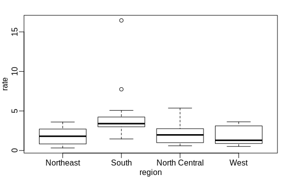
We can see that the South has higher murder rates than the other three regions.
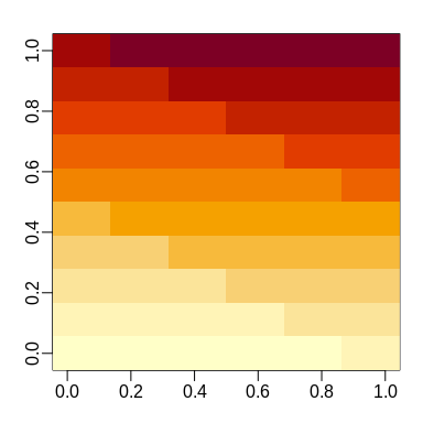
image
The image function displays the values in a matrix using color. Here is a quick example:
x <- matrix(1:120, 12, 10)
image(x)