Drop hier links of afbeeldingen om ze aan de editor toe te voegen.
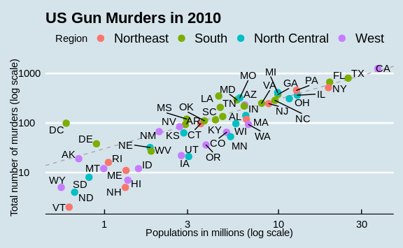
Now that we are done testing, we can write one piece of code that produces our desired plot from scratch.
library(ggthemes)
library(ggrepel)

r <- murders %>%
  summarize(rate = sum(total) /  sum(population) * 10^6) %>%
  pull(rate)

murders %>% ggplot(aes(population/10^6, total, label = abb)) +
  geom_abline(intercept = log10(r), lty = 2, color = "darkgrey") +
  geom_point(aes(col=region), size = 3) +
  geom_text_repel() +
  scale_x_log10() +
  scale_y_log10() +
  xlab("Populations in millions (log scale)") +
  ylab("Total number of murders (log scale)") +
  ggtitle("US Gun Murders in 2010") +
  scale_color_discrete(name = "Region") +
  theme_economist()