For these exercises, we will be using the vaccines data in the dslabs package:
library(dslabs)
data(us_contagious_diseases)
1. Pie charts are appropriate:
- When we want to display percentages.
- When ggplot2 is not available.
- When I am in a bakery.
- Never. Barplots and tables are always better.
Store your answer in q1.
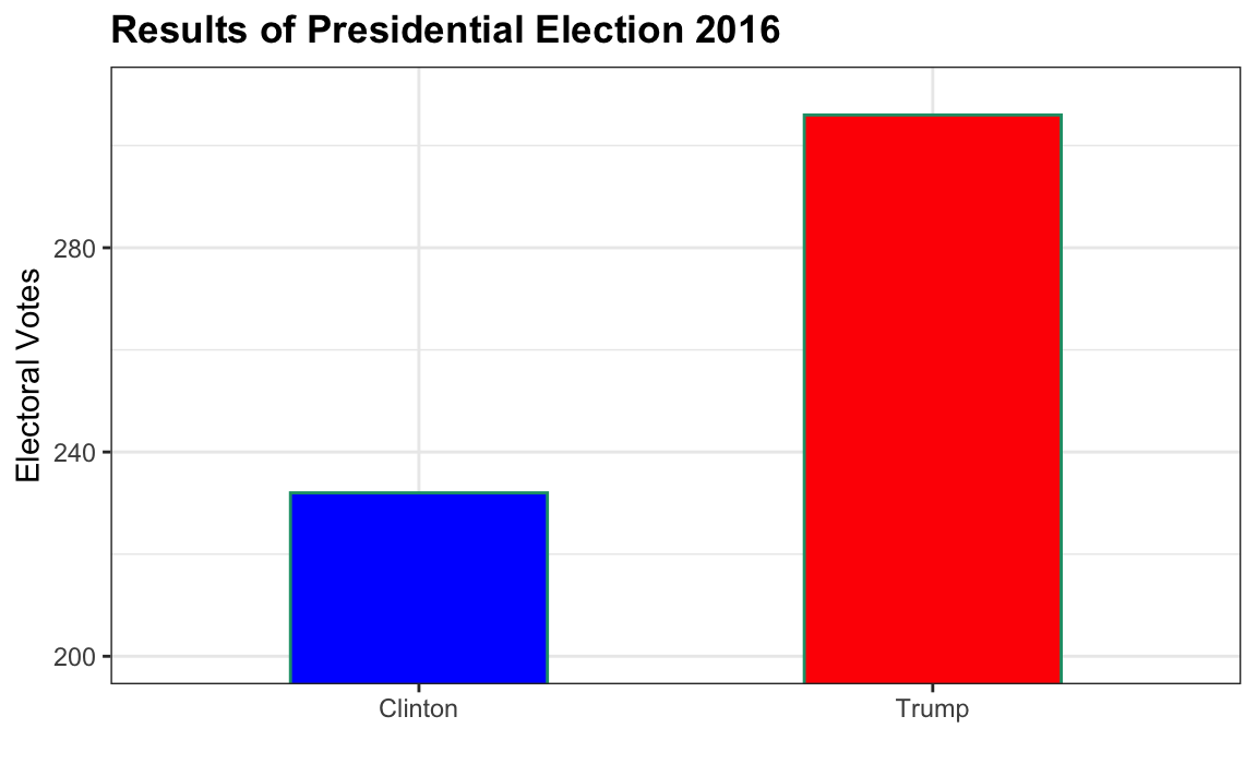
2. What is the problem with the plot below:

- The values are wrong. The final vote was 306 to 232.
- The axis does not start at 0. Judging by the length, it appears Trump received 3 times as many votes when, in fact, it was about 30% more.
- The colors should be the same.
- Percentages should be shown as a pie chart.
Store your answer in q2.