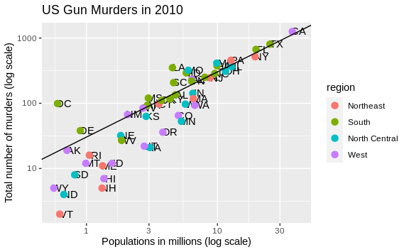
We often want to add shapes or annotation to figures that are not derived directly from the aesthetic mapping; examples include labels, boxes, shaded areas, and lines.
Here we want to add a line that represents the average murder rate for the entire country. Once we determine the per million rate to be \(r\), this line is defined by the formula: \(y = r x\), with \(y\) and \(x\) our axes: total murders and population in millions, respectively. In the log-scale this line turns into: \(\log(y) = \log(r) + \log(x)\). So in our plot it’s a line with slope 1 and intercept \(\log(r)\). To compute this value, we use our dplyr skills:
r <- murders %>%
  summarize(rate = sum(total) /  sum(population) * 10^6) %>%
  pull(rate)
To add a line we use the geom_abline function. ggplot2 uses ab
in the name to remind us we are supplying the intercept (a) and slope
(b). The default line has slope 1 and intercept 0 so we only have to
define the intercept:
p + geom_point(aes(col=region), size = 3) +
  geom_abline(intercept = log10(r))

Here geom_abline does not use any information from the data object.
We can change the line type and color of the lines using the arguments lty and color. More information on the different line types (and other aesthetic specifications) can be found with vignette("ggplot2-specs").
Also, we draw it first so it doesn’t go over our points.
p <- p + geom_abline(intercept = log10(r), lty = 2, color = "darkgrey") +
  geom_point(aes(col=region), size = 3)
Note that we have redefined p and used this new p below and in the
next section.
The default plots created by ggplot2 are already very useful. However, we frequently need to make minor tweaks to the default behavior. Although it is not always obvious how to make these even with the cheat sheet, ggplot2 is very flexible.
For example, we can make changes to the legend via the
scale_color_discrete function. In our plot the word region is
capitalized and we can change it like this:
p <- p + scale_color_discrete(name = "Region")