We now shift our attention to the second question related to the commonly held notion that wealth distribution across the world has become worse during the last decades. When general audiences are asked if poor countries have become poorer and rich countries become richer, the majority answers yes. By using stratification, histograms, smooth densities, and boxplots, we will be able to understand if this is in fact the case. First we learn how transformations can sometimes help provide more informative summaries and plots.
The gapminder data table includes a column with the countries’ gross
domestic product (GDP). GDP measures the market value of goods and
services produced by a country in a year. The GDP per person is often
used as a rough summary of a country’s wealth. Here we divide this
quantity by 365 to obtain the more interpretable measure dollars per
day. Using current US dollars as a unit, a person surviving on an
income of less than $2 a day is defined to be living in absolute
poverty. We add this variable to the data table:
gapminder <- gapminder %>% mutate(dollars_per_day = gdp/population/365)
The GDP values are adjusted for inflation and represent current US dollars, so these values are meant to be comparable across the years. Of course, these are country averages and within each country there is much variability. All the graphs and insights described below relate to country averages and not to individuals.
Log transformation
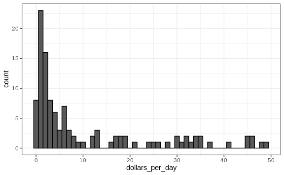
Here is a histogram of per day incomes from 1970:
past_year <- 1970
gapminder %>%
  filter(year == past_year & !is.na(gdp)) %>%
  ggplot(aes(dollars_per_day)) +
  geom_histogram(binwidth = 1, color = "black")
We use the color = "black" argument to draw a boundary and clearly
distinguish the bins.
In this plot, we see that for the majority of countries, averages are below $10 a day. However, the majority of the x-axis is dedicated to the 35 countries with averages above $10. So the plot is not very informative about countries with values below $10 a day.
It might be more informative to quickly be able to see how many countries have average daily incomes of about $1 (extremely poor), $2 (very poor), $4 (poor), $8 (middle), $16 (well off), $32 (rich), $64 (very rich) per day. These changes are multiplicative and log transformations convert multiplicative changes into additive ones: when using base 2, a doubling of a value turns into an increase by 1.
Here is the distribution if we apply a log base 2 transform:
gapminder %>%
  filter(year == past_year & !is.na(gdp)) %>%
  ggplot(aes(log2(dollars_per_day))) +
  geom_histogram(binwidth = 1, color = "black")
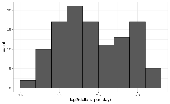
In a way this provides a close-up of the mid to lower income countries.
Which base?
In the case above, we used base 2 in the log transformations. Other common choices are base \(\mathrm{e}\) (the natural log) and base 10.
In general, we do not recommend using the natural log for data exploration and visualization. This is because while \(2^2, 2^3, 2^4, \dots\) or \(10^2, 10^3, \dots\) are easy to compute in our heads, the same is not true for \(\mathrm{e}^2, \mathrm{e}^3, \dots\), so the scale is not intuitive or easy to interpret.
In the dollars per day example, we used base 2 instead of base 10 because the resulting range is easier to interpret. The range of the values being plotted is 0.327, 48.885.
In base 10, this turns into a range that includes very few integers: just 0 and 1. With base two, our range includes -2, -1, 0, 1, 2, 3, 4, and 5. It is easier to compute \(2^x\) and \(10^x\) when \(x\) is an integer and between -10 and 10, so we prefer to have smaller integers in the scale. Another consequence of a limited range is that choosing the binwidth is more challenging. With log base 2, we know that a binwidth of 1 will translate to a bin with range \(x\) to \(2x\).
For an example in which base 10 makes more sense, consider population sizes. A log base 10 is preferable since the range for these is:
filter(gapminder, year == past_year) %>%
  summarize(min = min(population), max = max(population))
#>     min      max
#> 1 46075 8.09e+08
Here is the histogram of the transformed values:
gapminder %>%
  filter(year == past_year) %>%
  ggplot(aes(log10(population))) +
  geom_histogram(binwidth = 0.5, color = "black")

In the above, we quickly see that country populations range between ten thousand and ten billion.
Transform the values or the scale?
There are two ways we can use log transformations in plots. We can log the values before plotting them or use log scales in the axes. Both approaches are useful and have different strengths. If we log the data, we can more easily interpret intermediate values in the scale. For example, if we see:
----1----x----2--------3----
for log transformed data, we know that the value of \(x\) is about 1.5. If the scales are logged:
----1----x----10------100---
then, to determine x, we need to compute \(10^{1.5}\), which is not
easy to do in our heads. The advantage of using logged scales is that we
see the original values on the axes. However, the advantage of showing
logged scales is that the original values are displayed in the plot,
which are easier to interpret. For example, we would see “32 dollars a
day” instead of “5 log base 2 dollars a day”.
As we learned earlier, if we want to scale the axis with logs, we can
use the scale_x_continuous function. Instead of logging the values
first, we apply this layer:
gapminder %>%
  filter(year == past_year & !is.na(gdp)) %>%
  ggplot(aes(dollars_per_day)) +
  geom_histogram(binwidth = 1, color = "black") +
  scale_x_continuous(trans = "log2")

Note that the log base 10 transformation has its own function:
scale_x_log10(), but currently base 2 does not, although we could
easily define our own.
There are other transformations available through the trans argument.
As we learn later on, the square root (sqrt) transformation is useful
when considering counts. The logistic transformation (logit) is useful
when plotting proportions between 0 and 1. The reverse transformation
is useful when we want smaller values to be on the right or on top.
Visualizing multimodal distributions
In the histogram above we see two bumps: one at about 4 and another at about 32. In statistics these bumps are sometimes referred to as modes. The mode of a distribution is the value with the highest frequency. The mode of the normal distribution is the average. When a distribution, like the one above, doesn’t monotonically decrease from the mode, we call the locations where it goes up and down again local modes and say that the distribution has multiple modes.
The histogram above suggests that the 1970 country income distribution has two modes: one at about 2 dollars per day (1 in the log 2 scale) and another at about 32 dollars per day (5 in the log 2 scale). This bimodality is consistent with a dichotomous world made up of countries with average incomes less than $8 (3 in the log 2 scale) a day and countries above that.