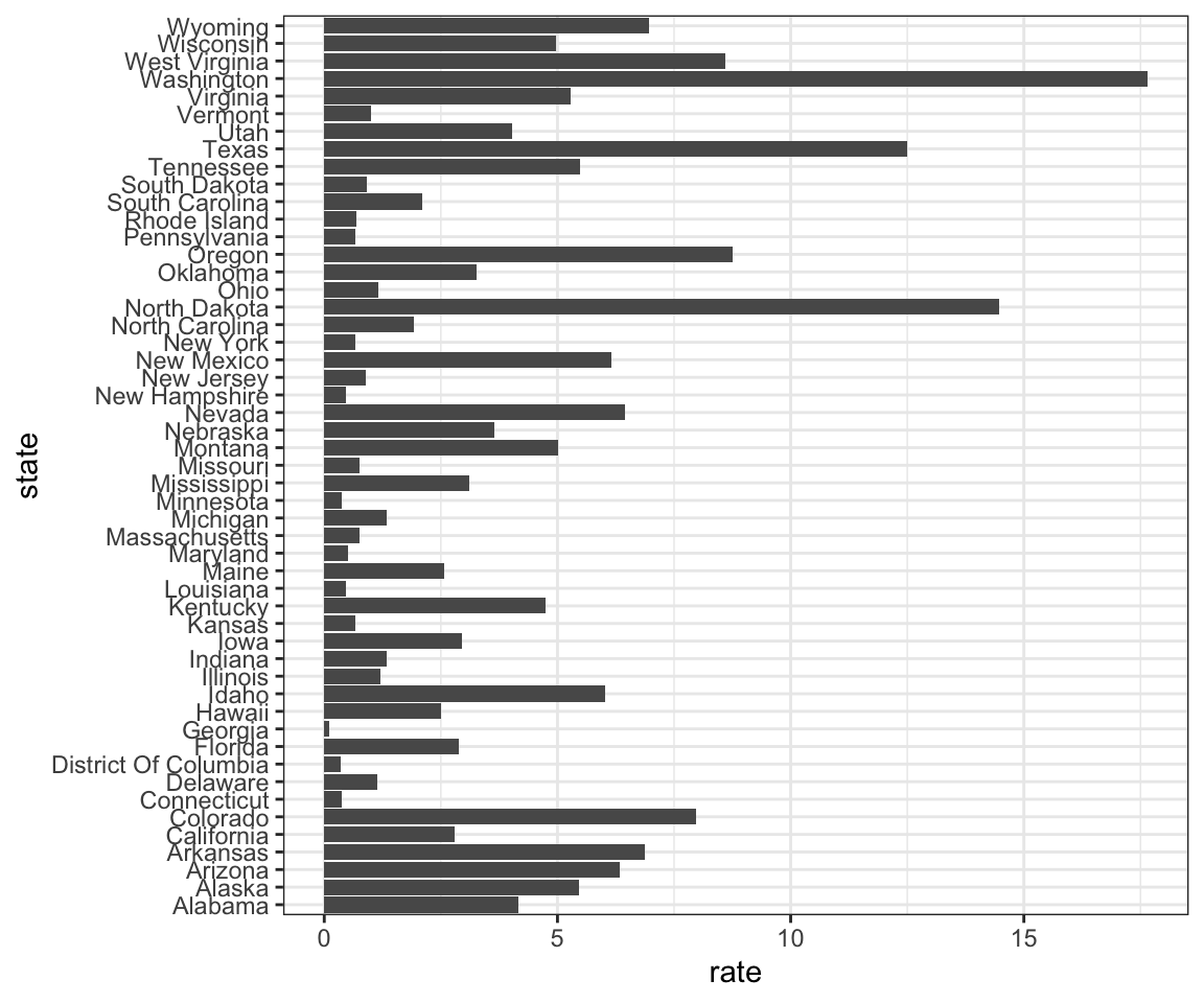
To make the plot on the right from the previous question, we have to reorder the levels of the states’ variables.
dat <- us_contagious_diseases %>%
  filter(year == 1967 & disease=="Measles" & !is.na(population)) %>%
  mutate(rate = count / population * 10000 * 52 / weeks_reporting)
Note what happens when we make a barplot:
dat %>% ggplot(aes(state, rate)) +
  geom_bar(stat="identity") +
  coord_flip()
Define these objects:
state <- dat$state
rate <- dat$count/dat$population*10000*52/dat$weeks_reporting
1. Redefine the state object so that the levels are re-ordered by the rates.
Note that this only changes the order of the levels and doesn’t re-order the vector itself.
2. Now with one line of code (not using the state variable defined in the previous question), define the dat table as done above, but
change the code to use the mutate function to re-order the state
variable by the rate so that the levels are re-ordered by this variable. Then make a
barplot using the code above, but for this new dat. Store the resulting ggplot object in p