It turns out that, in some cases, the average and the standard deviation are pretty much all we need to understand the data. We will learn data visualization techniques that will help us determine when this two number summary is appropriate. These same techniques will serve as an alternative for when two numbers are not enough.
The most basic statistical summary of a list of objects or numbers is its distribution. The simplest way to think of a distribution is as a compact description of a list with many entries. This concept should not be new for readers of this book. For example, with categorical data, the distribution simply describes the proportion of each unique category. The sex represented in the heights dataset is:
#>
#> Female   Male
#>  0.227  0.773
This two-category frequency table is the simplest form of a distribution. We don’t really need to visualize it since one number describes everything we need to know: 23% are females and the rest are males. When there are more categories, then a simple barplot describes the distribution. Here is an example with US state regions:
#> `summarise()` ungrouping output (override with `.groups` argument)
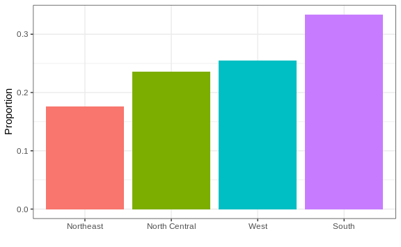
This particular plot simply shows us four numbers, one for each category. We usually use barplots to display a few numbers. Although this particular plot does not provide much more insight than a frequency table itself, it is a first example of how we convert a vector into a plot that succinctly summarizes all the information in the vector. When the data is numerical, the task of displaying distributions is more challenging.