We will construct a graph that summarizes the US murders dataset that looks like this:
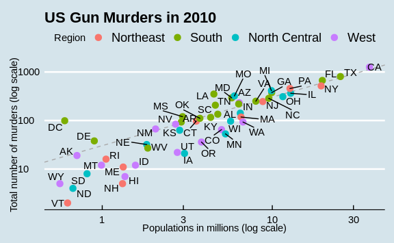
We can clearly see how much states vary across population size and the total number of murders. Not surprisingly, we also see a clear relationship between murder totals and population size. A state falling on the dashed grey line has the same murder rate as the US average. The four geographic regions are denoted with color, which depicts how most southern states have murder rates above the average.
This data visualization shows us pretty much all the information in the data table. The code needed to make this plot is relatively simple. We will learn to create the plot part by part.
The first step in learning ggplot2 is to be able to break a graph apart into components. Let’s break down the plot above and introduce some of the ggplot2 terminology. The main three components to note are:
- Data: The US murders data table is being summarized. We refer to this as the data component.
- Geometry: The plot above is a scatterplot. This is referred to as the geometry component. Other possible geometries are barplot, histogram, smooth densities, qqplot, and boxplot. We will learn more about these in the Data Visualization part of the book.
- Aesthetic mapping: The plot uses several visual cues to represent the information provided by the dataset. The two most important cues in this plot are the point positions on the x-axis and y-axis, which represent population size and the total number of murders, respectively. Each point represents a different observation, and we map data about these observations to visual cues like x- and y-scale. Color is another visual cue that we map to region. We refer to this as the aesthetic mapping component. How we define the mapping depends on what geometry we are using.
We also note that:
- The points are labeled with the state abbreviations.
- The range of the x-axis and y-axis appears to be defined by the range of the data. They are both on log-scales.
- There are labels, a title, a legend, and we use the style of The Economist magazine.
We will now construct the plot piece by piece.
We start by loading the relevant libraries and the murders dataset (from dslabs):
library(ggplot2)
library(dplyr)
library(dslabs)
data(murders)