Note: The plots shown in the course notes below have changed compared to the ones shown in the video, the general idea however is still the same.
A histogram showed us that the 1970 income distribution values show a dichotomy. However, the histogram does not show us if the two groups of countries are west versus the developing world.
Let’s start by quickly examining the data by region. We reorder the regions by the median value and use a log scale.
gapminder %>%
  filter(year == past_year & !is.na(gdp)) %>%
  mutate(region = reorder(region, dollars_per_day, FUN = median)) %>%
  ggplot(aes(dollars_per_day, region)) +
  geom_point() +
  scale_x_continuous(trans = "log2")
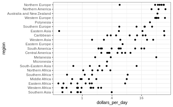
We can already see that there is indeed a “west versus the rest” dichotomy: we see two clear groups, with the rich group composed of North America, Northern and Western Europe, New Zealand and Australia. We define groups based on this observation:
gapminder <- gapminder %>%
  mutate(group = case_when(
    region %in% c("Western Europe", "Northern Europe","Southern Europe",
                    "Northern America",
                  "Australia and New Zealand") ~ "West",
    region %in% c("Eastern Asia", "South-Eastern Asia") ~ "East Asia",
    region %in% c("Caribbean", "Central America",
                  "South America") ~ "Latin America",
    continent == "Africa" &
      region != "Northern Africa" ~ "Sub-Saharan",
    TRUE ~ "Others"))
We turn this group variable into a factor to control the order of the
levels:
gapminder <- gapminder %>%
  mutate(group = factor(group, levels = c("Others", "Latin America",
                                          "East Asia", "Sub-Saharan",
                                          "West")))
In the next section we demonstrate how to visualize and compare distributions across groups.
Boxplots
The exploratory data analysis above has revealed two characteristics
about average income distribution in 1970. Using a histogram, we found a
bimodal distribution with the modes relating to poor and rich countries.
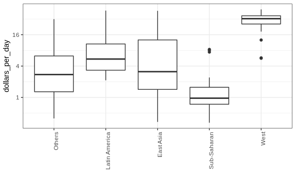
We now want to compare the distribution across these five groups to
confirm the “west versus the rest” dichotomy. The number of points in
each category is large enough that a summary plot may be useful. We
could generate five histograms or five density plots, but it may be more
practical to have all the visual summaries in one plot. We therefore
start by stacking boxplots next to each other. Note that we add the
layer theme(axis.text.x = element_text(angle = 90, hjust = 1)) to turn
the group labels vertical, since they do not fit if we show them
horizontally, and remove the axis label to make space.
p <- gapminder %>%
  filter(year == past_year & !is.na(gdp)) %>%
  ggplot(aes(group, dollars_per_day)) +
  geom_boxplot() +
  scale_y_continuous(trans = "log2") +
  xlab("") +
  theme(axis.text.x = element_text(angle = 90, hjust = 1))
p
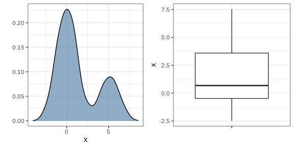
Boxplots have the limitation that by summarizing the data into five numbers, we might miss important characteristics of the data. One way to avoid this is by showing the data.
p + geom_point(alpha = 0.5)

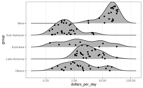
Ridge plots
Showing each individual point does not always reveal important characteristics of the distribution. Although not the case here, when the number of data points is so large that there is over-plotting, showing the data can be counterproductive. Boxplots help with this by providing a five-number summary, but this has limitations too. For example, boxplots will not permit us to discover bimodal distributions. To see this, note that the two plots below are summarizing the same dataset:
In cases in which we are concerned that the boxplot summary is too simplistic, we can show stacked smooth densities or histograms. We refer to these as ridge plots. Because we are used to visualizing densities with values in the x-axis, we stack them vertically. Also, because more space is needed in this approach, it is convenient to overlay them. The package ggridges provides a convenient function for doing this. Here is the income data shown above with boxplots but with a ridge plot.
library(ggridges)
p <- gapminder %>%
  filter(year == past_year & !is.na(dollars_per_day)) %>%
  ggplot(aes(dollars_per_day, group)) +
  scale_x_continuous(trans = "log2")
p  + geom_density_ridges()
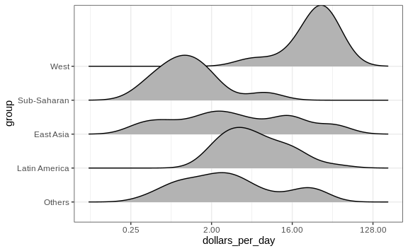
Note that we have to invert the x and y used for the boxplot. A
useful geom_density_ridges parameter is scale, which lets you
determine the amount of overlap, with scale = 1 meaning no overlap and
larger values resulting in more overlap.
If the number of data points is small enough, we can add them to the ridge plot using the following code:
p + geom_density_ridges(jittered_points = TRUE)
By default, the height of the points is jittered and should not be interpreted in any way. To show data points, but without using jitter we can use the following code to add what is referred to as a rug representation of the data.
p + geom_density_ridges(jittered_points = TRUE,
                        position = position_points_jitter(height = 0),
                        point_shape = '|', point_size = 3,
                        point_alpha = 1, alpha = 0.7)

Example: 1970 versus 2010 income distributions
Data exploration clearly shows that in 1970 there was a “west versus the
rest” dichotomy. But does this dichotomy persist? Let’s use facet_grid
see how the distributions have changed. To start, we will focus on two
groups: the west and the rest. We make four histograms.
past_year <- 1970
present_year <- 2010
years <- c(past_year, present_year)
gapminder %>%
  filter(year %in% years & !is.na(gdp)) %>%
  mutate(west = ifelse(group == "West", "West", "Developing")) %>%
  ggplot(aes(dollars_per_day)) +
  geom_histogram(binwidth = 1, color = "black") +
  scale_x_continuous(trans = "log2") +
  facet_grid(year ~ west)

Before we interpret the findings of this plot, we notice that there are more countries represented in the 2010 histograms than in 1970: the total counts are larger. One reason for this is that several countries were founded after 1970. For example, the Soviet Union divided into several countries during the 1990s. Another reason is that data was available for more countries in 2010.
We remake the plots using only countries with data available for both
years. In the data wrangling part of this book, we will learn
tidyverse tools that permit us to write efficient code for this, but
here we can use simple code using the intersect function:
country_list_1 <- gapminder %>%
  filter(year == past_year & !is.na(dollars_per_day)) %>%
  pull(country)

country_list_2 <- gapminder %>%
  filter(year == present_year & !is.na(dollars_per_day)) %>%
  pull(country)

country_list <- intersect(country_list_1, country_list_2)
These 108 account for 86% of the world population, so this subset should be representative.
Let’s remake the plot, but only for this subset by simply adding
country %in% country_list to the filter function:

We now see that the rich countries have become a bit richer, but percentage-wise, the poor countries appear to have improved more. In particular, we see that the proportion of developing countries earning more than $16 a day increased substantially.
To see which specific regions improved the most, we can remake the boxplots we made above, but now adding the year 2010 and then using facet to compare the two years.
gapminder %>%
  filter(year %in% years & country %in% country_list) %>%
  ggplot(aes(group, dollars_per_day)) +
  geom_boxplot() +
  theme(axis.text.x = element_text(angle = 90, hjust = 1)) +
  scale_y_continuous(trans = "log2") +
  xlab("") +
  facet_grid(. ~ year)
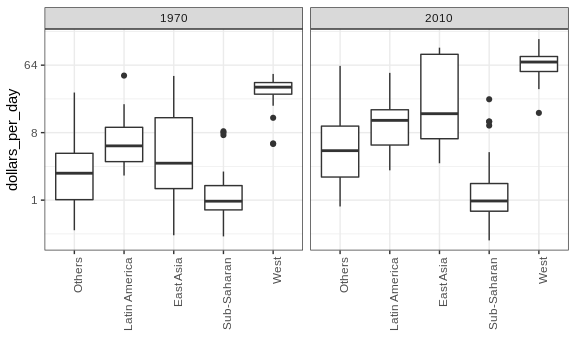
Here, we pause to introduce another powerful ggplot2 feature. Because we want to compare each region before and after, it would be convenient to have the 1970 boxplot next to the 2010 boxplot for each region. In general, comparisons are easier when data are plotted next to each other.
So instead of faceting, we keep the data from each year together and ask to color (or fill) them depending on the year. Note that groups are automatically separated by year and each pair of boxplots drawn next to each other. Because year is a number, we turn it into a factor since ggplot2 automatically assigns a color to each category of a factor. Note that we have to convert the year columns from numeric to factor.
gapminder %>%
  filter(year %in% years & country %in% country_list) %>%
  mutate(year = factor(year)) %>%
  ggplot(aes(group, dollars_per_day, fill = year)) +
  geom_boxplot() +
  theme(axis.text.x = element_text(angle = 90, hjust = 1)) +
  scale_y_continuous(trans = "log2") +
  xlab("")

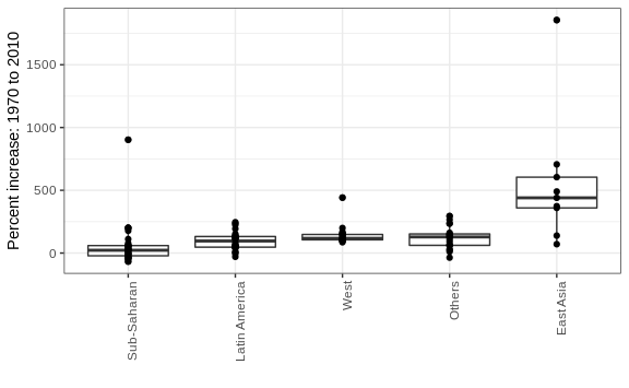
Finally, we point out that if what we are most interested in is comparing before and after values, it might make more sense to plot the percentage increases. We are still not ready to learn to code this, but here is what the plot would look like:
The previous data exploration suggested that the income gap between rich and poor countries has narrowed considerably during the last 40 years. We used a series of histograms and boxplots to see this. We suggest a succinct way to convey this message with just one plot.
Let’s start by noting that density plots for income distribution in 1970 and 2010 deliver the message that the gap is closing:
gapminder %>%
  filter(year %in% years & country %in% country_list) %>%
  ggplot(aes(dollars_per_day)) +
  geom_density(fill = "grey") +
  scale_x_continuous(trans = "log2") +
  facet_grid(. ~ year)
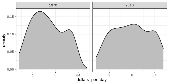
In the 1970 plot, we see two clear modes: poor and rich countries. In 2010, it appears that some of the poor countries have shifted towards the right, closing the gap.
The next message we need to convey is that the reason for this change in distribution is that several poor countries became richer, rather than some rich countries becoming poorer. To do this, we can assign a color to the groups we identified during data exploration.
However, we first need to learn how to make these smooth densities in a way that preserves information on the number of countries in each group. To understand why we need this, note the discrepancy in the size of each group:
gapminder %>%
  filter(year == 1970 & country %in% country_list) %>%
  mutate(group = ifelse(group == "West", "West", "Developing")) %>%
  count(group)
| Developing | West |
|---|---|
| 87 | 21 |
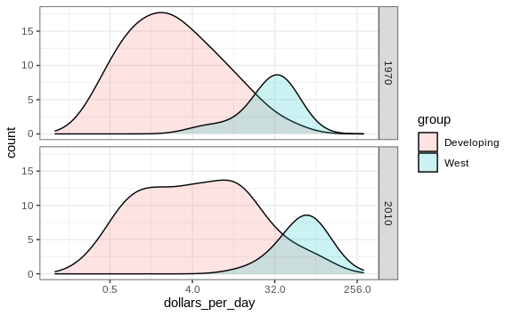
But when we overlay two densities, the default is to have the area represented by each distribution add up to 1, regardless of the size of each group:
gapminder %>%
  filter(year %in% years & country %in% country_list) %>%
  mutate(group = ifelse(group == "West", "West", "Developing")) %>%
  ggplot(aes(dollars_per_day, fill = group)) +
  scale_x_continuous(trans = "log2") +
  geom_density(alpha = 0.2) +
  facet_grid(year ~ .)

This makes it appear as if there are the same number of countries in
each group. To change this, we will need to learn to access computed
variables with geom_density function.
Accessing computed variables
To have the areas of these densities be proportional to the size of the
groups, we can simply multiply the y-axis values by the size of the
group. From the geom_density help file, we see that the functions
compute a variable called count that does exactly this. We want this
variable to be on the y-axis rather than the density.
In ggplot2, we access these variables by surrounding the name with two dots. We will therefore use the following mapping:
aes(x = dollars_per_day, y = ..count..)
We can now create the desired plot by simply changing the mapping in the previous code chunk. We will also expand the limits of the x-axis.
p <- gapminder %>%
  filter(year %in% years & country %in% country_list) %>%
  mutate(group = ifelse(group == "West", "West", "Developing")) %>%
  ggplot(aes(dollars_per_day, y = ..count.., fill = group)) +
  scale_x_continuous(trans = "log2", limit = c(0.125, 300))

p + geom_density(alpha = 0.2) +
  facet_grid(year ~ .)
If we want the densities to be smoother, we use the bw argument so
that the same bandwidth is used in each density. We selected 0.75 after
trying out several values.
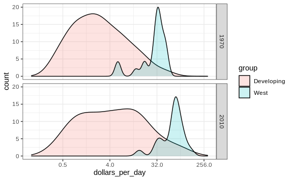
p + geom_density(alpha = 0.2, bw = 0.75) + facet_grid(year ~ .)
This plot now shows what is happening very clearly. The developing world distribution is changing. A third mode appears consisting of the countries that most narrowed the gap.
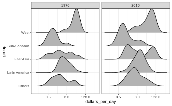
To visualize if any of the groups defined above are driving this we can quickly make a ridge plot:
gapminder %>%
  filter(year %in% years & !is.na(dollars_per_day)) %>%
  ggplot(aes(dollars_per_day, group)) +
  scale_x_continuous(trans = "log2") +
  geom_density_ridges(adjust = 1.5) +
  facet_grid(. ~ year)
Another way to achieve this is by stacking the densities on top of each other:
gapminder %>%
    filter(year %in% years & country %in% country_list) %>%
  group_by(year) %>%
  mutate(weight = population/sum(population)*2) %>%
  ungroup() %>%
  ggplot(aes(dollars_per_day, fill = group)) +
  scale_x_continuous(trans = "log2", limit = c(0.125, 300)) +
  geom_density(alpha = 0.2, bw = 0.75, position = "stack") +
  facet_grid(year ~ .)

Here we can clearly see how the distributions for East Asia, Latin America, and others shift markedly to the right. While Sub-Saharan Africa remains stagnant.
Notice that we order the levels of the group so that the West’s density is plotted first, then Sub-Saharan Africa. Having the two extremes plotted first allows us to see the remaining bimodality better.
Weighted densities
As a final point, we note that these distributions weigh every country
the same. So if most of the population is improving, but living in a
very large country, such as China, we might not appreciate this. We can
actually weight the smooth densities using the weight mapping
argument. The plot then looks like this:
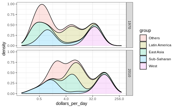
This particular figure shows very clearly how the income distribution gap is closing with most of the poor remaining in Sub-Saharan Africa.